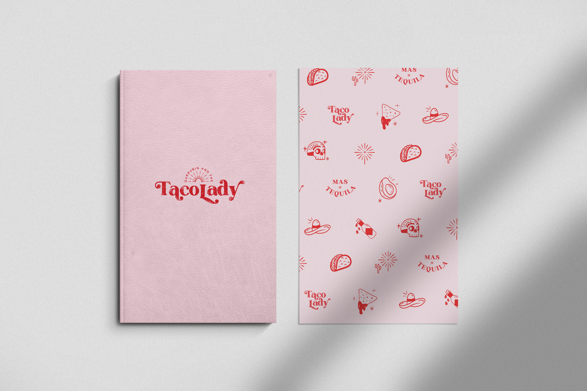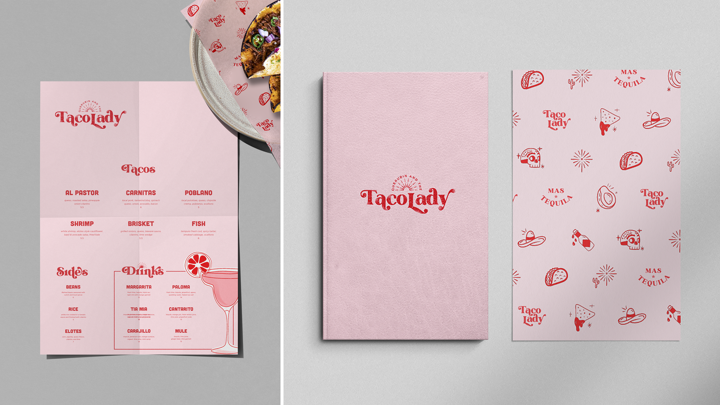
Brand identity and design for a taco shop.
Here you'll discover the compelling journey of crafting a unique brand identity for a beloved local taco eatery, 'Querubin and the Taco Lady.' The name, 'Querubin,' meaning 'cherub/angel' in English, serves as a heartfelt tribute to The Taco Lady's late husband, infusing a touching sentiment into the brand.
My primary aim in shaping this brand was to encapsulate the essence of femininity and playfulness that defines The Taco Lady herself. The restaurant, offering a relaxed and welcoming dining experience, was in need of a design aesthetic that resonated with its casual charm. To achieve this, I developed playful sketches that could be seamlessly incorporated into various elements throughout the establishment, transforming them into captivating design patterns.


